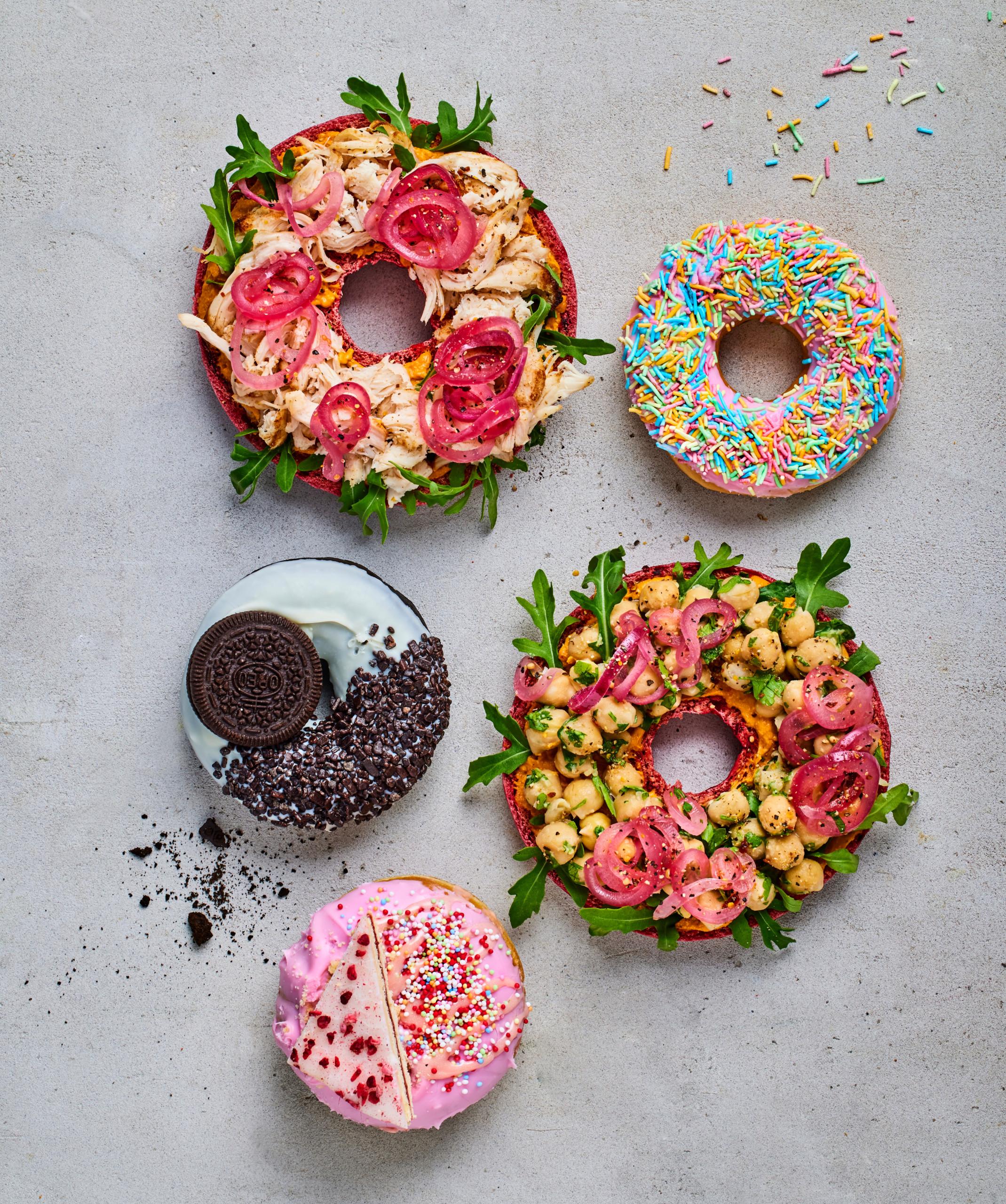
From shades of yellow and pink to a modern café with homemade bagels, premium coffee, cold pressed juice – and donuts, of course.
The Nordic look
Juice, bagels, coffee. New additions to the Bronuts menu card. Their identity as such needed alignment, so the looks reflected a modern café with something for everyone. While simultaneously not straying too far away from the old expression.
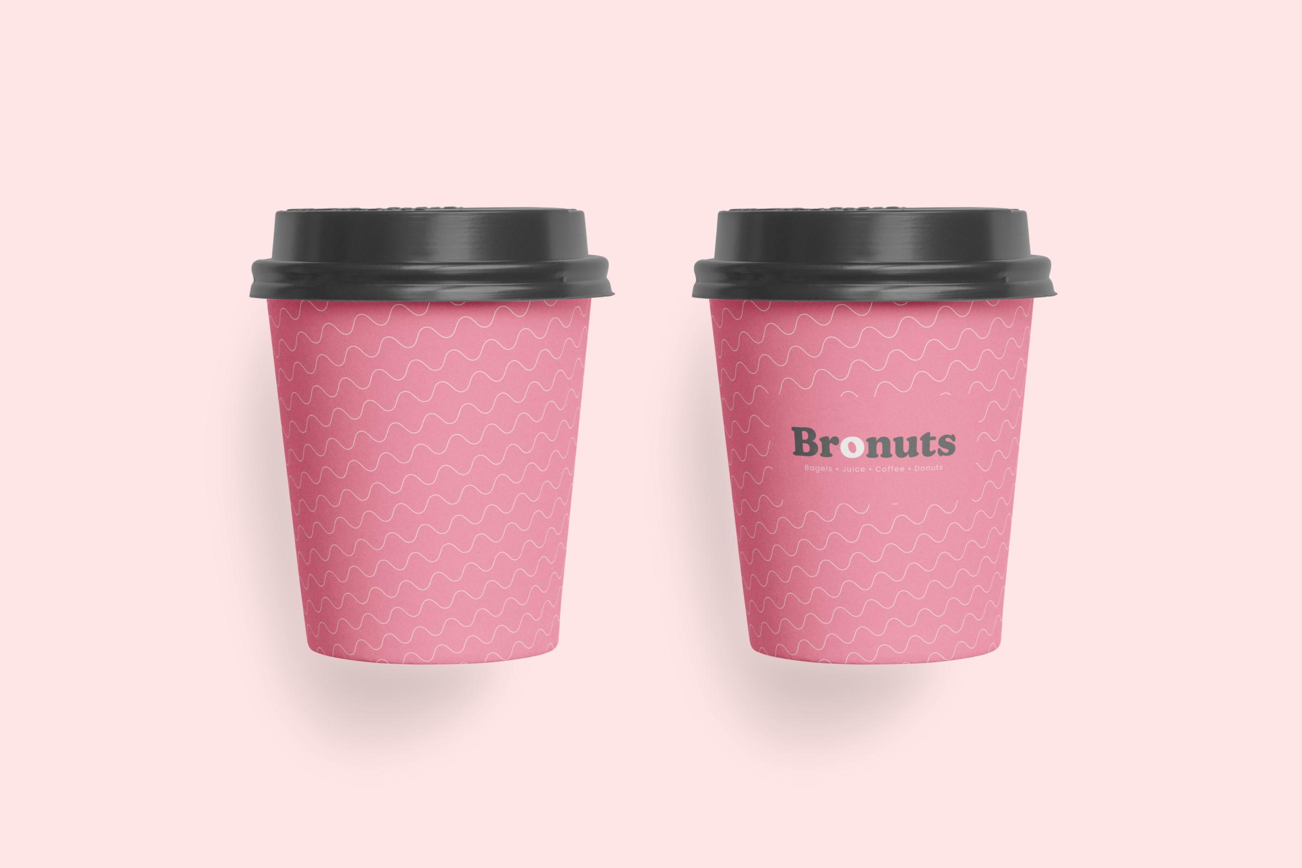
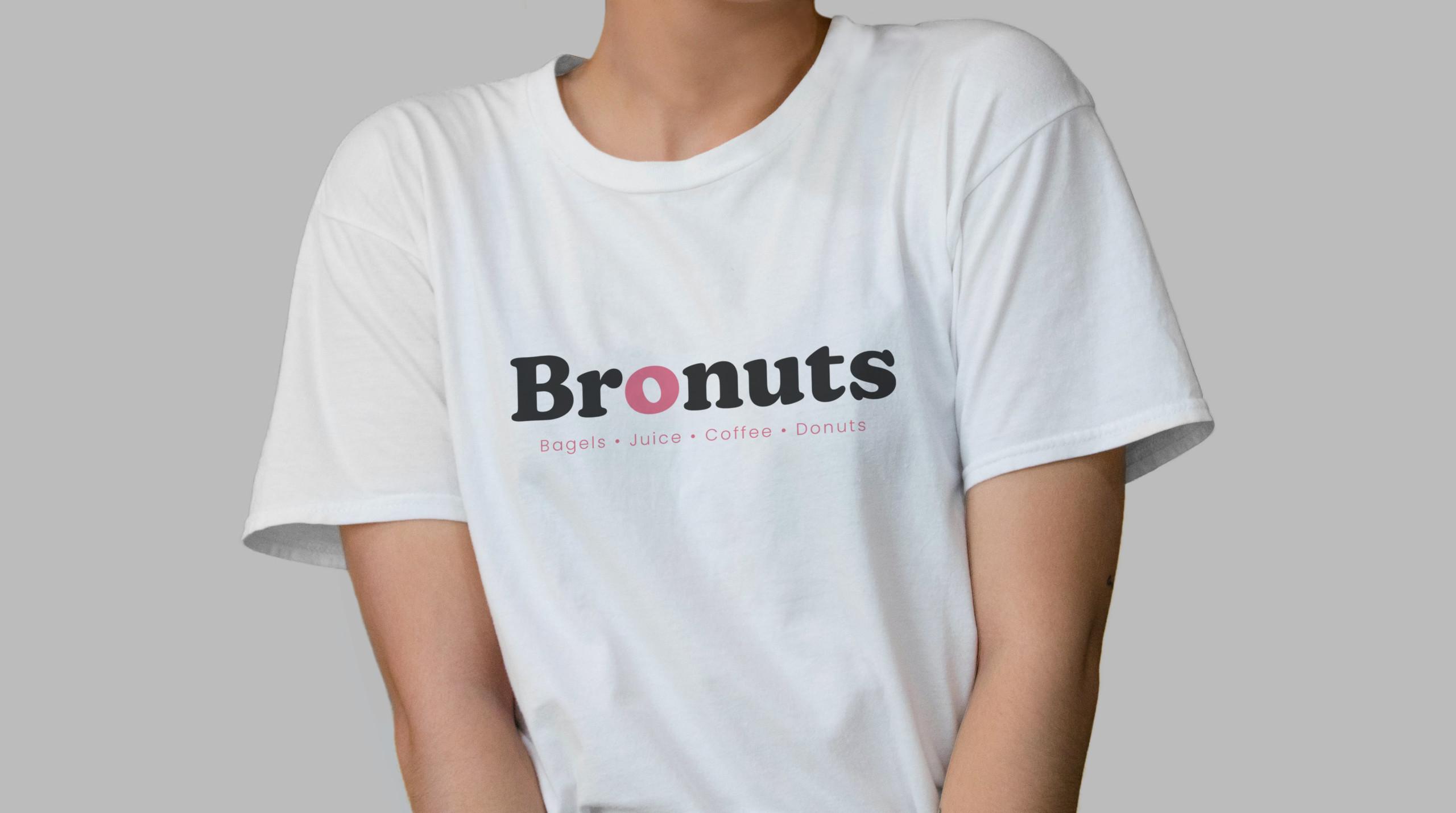
- Same name. New, adjusted logo
- Dynamic and appetizing logotype, with a fitting geometric font
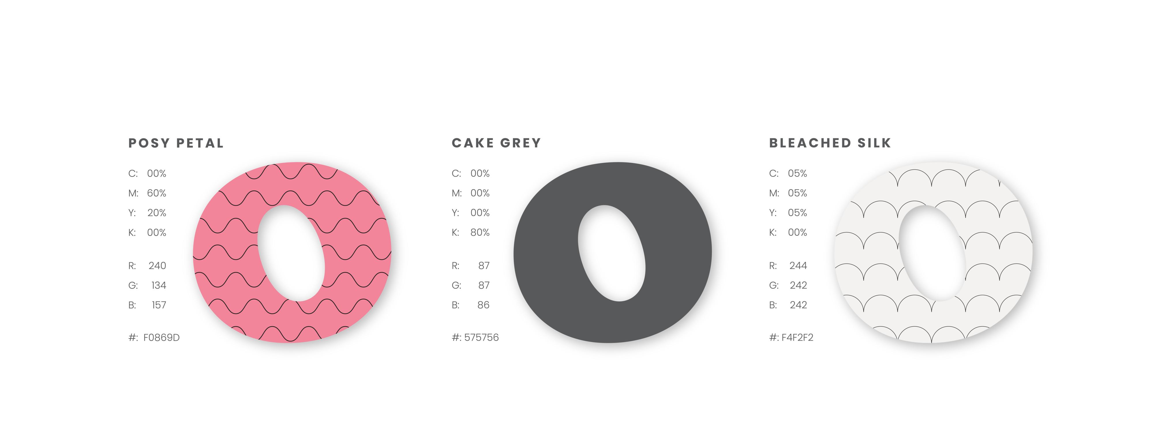
- Slightly muted colors that stylishly hint at the previous look
A fresh and straightforward website
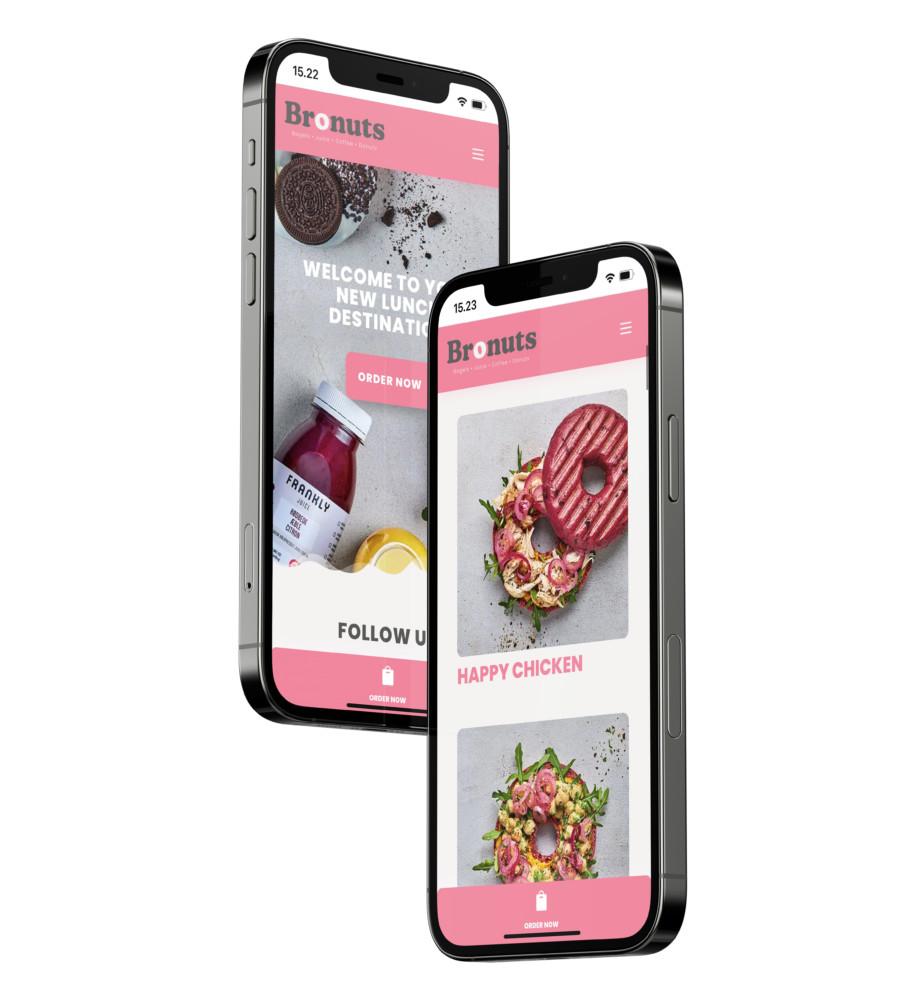
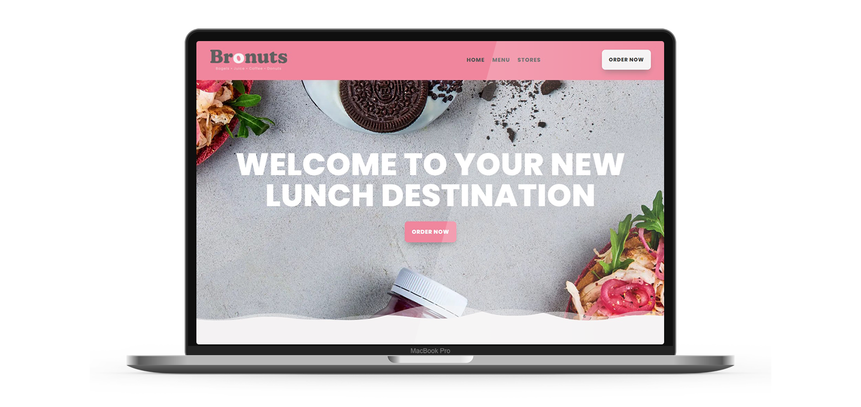
When you enter Bronuts’ new website, you should not be in doubt that they have been going through a transformation. Right from the first screen, you are welcomed by their new identity, in the form of both logo, colors and elegant pictures of their new selection.
Everything is still kept simple and managable. The selection is presented along with appetizing pictures, whether it be bagels, juice or their famous donuts. Their new brand shines through across all details. And with the option of ordering directly through their website, Bronuts have made their products more available than ever before.