Our long-time customer Kolme Kiveä Ravintolat opened a new restaurant called Como in Lappeenranta, Finland. The name and interior of the restaurant were already in place, so our main challenge was to build a visual and communicative brand identity based on this. The restaurant was built in a new building, so the final look was something you could only imagine.
Today is Muikkunta!
The client wanted Como’s tone of voice to be fresh and new – just like the brand-new restaurant space. The tone of Como’s communication voice is a bit strange, with a hint of whininess, but in a wonderfully sympathetic and intelligent way.
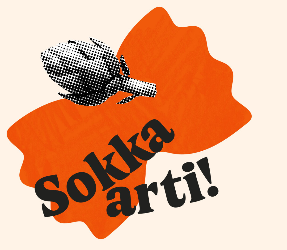
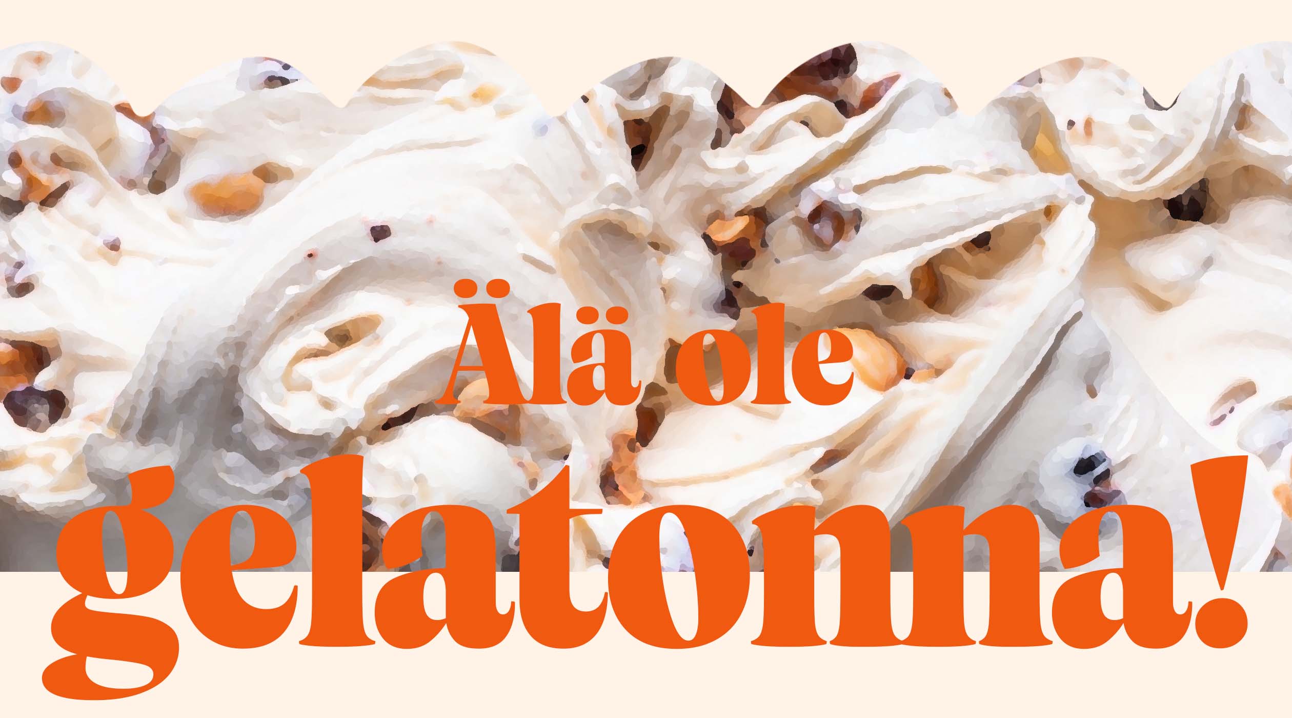
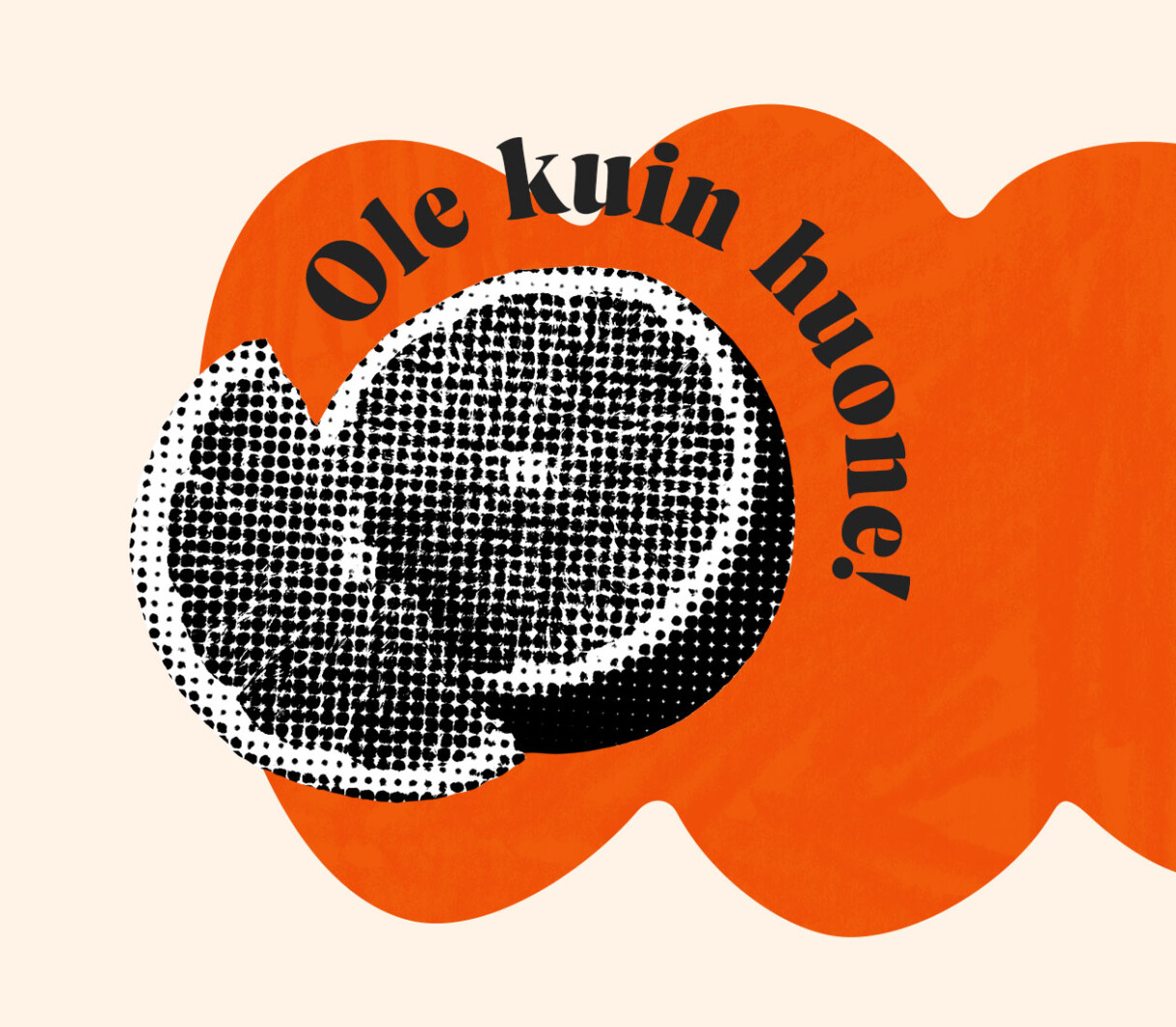
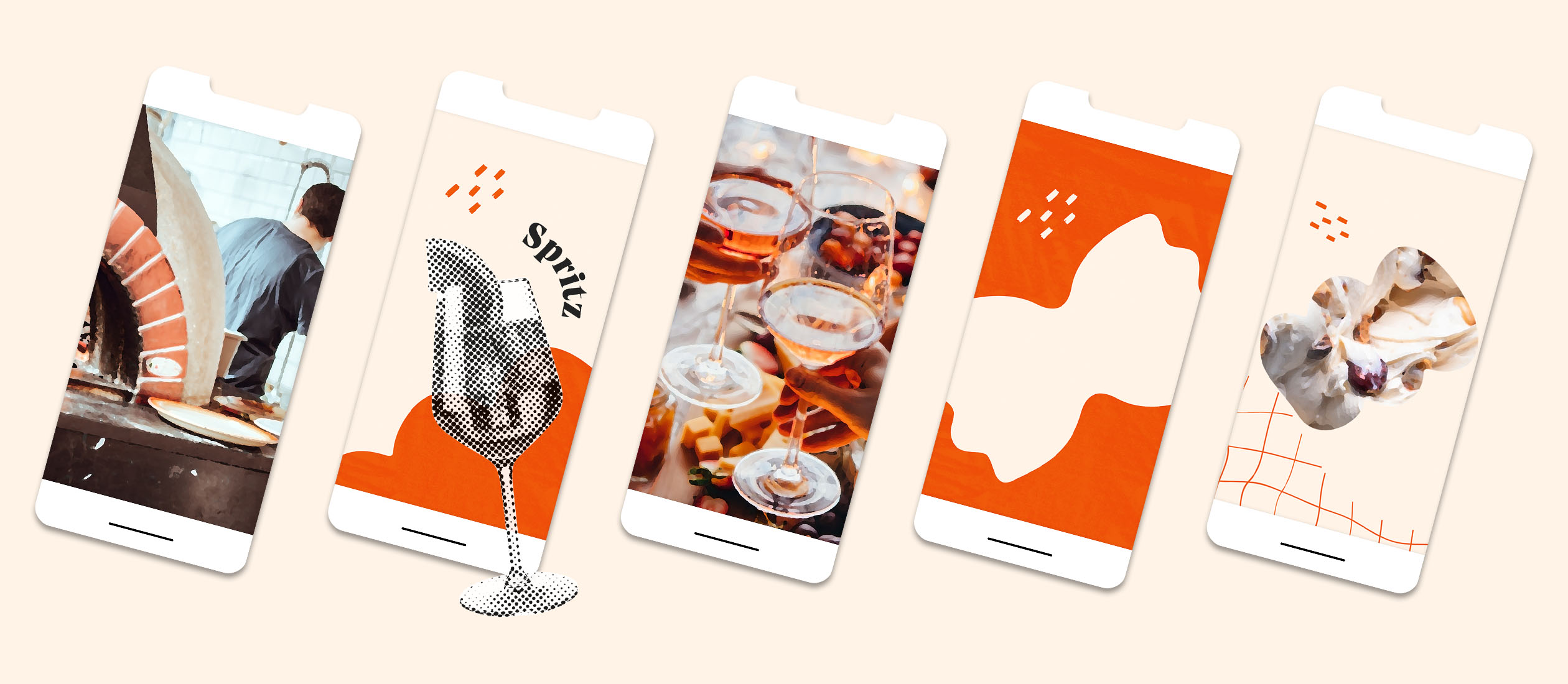
The spice of Como’s otherwise matter-of-fact communication is a kind of “comment track”, which consists of various short statements and exclamations. A verbal snack that delights, surprises, explains or even make you stop to think about it in a new light.
Oh, the French!
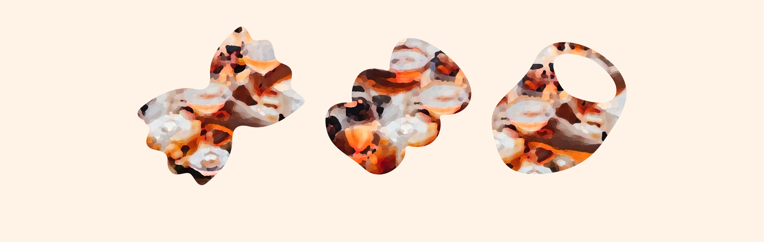
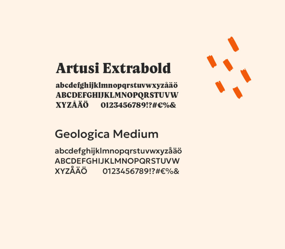
The client already had a strong vision for the visuals, to which we brought edginess, clarity, and linearity.
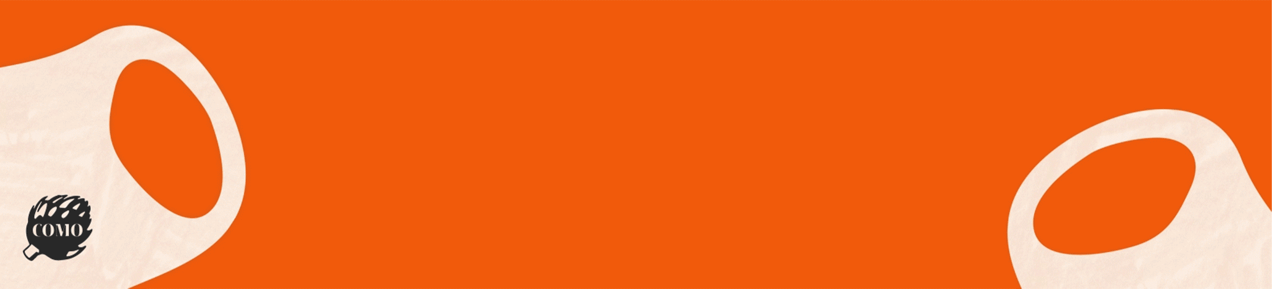
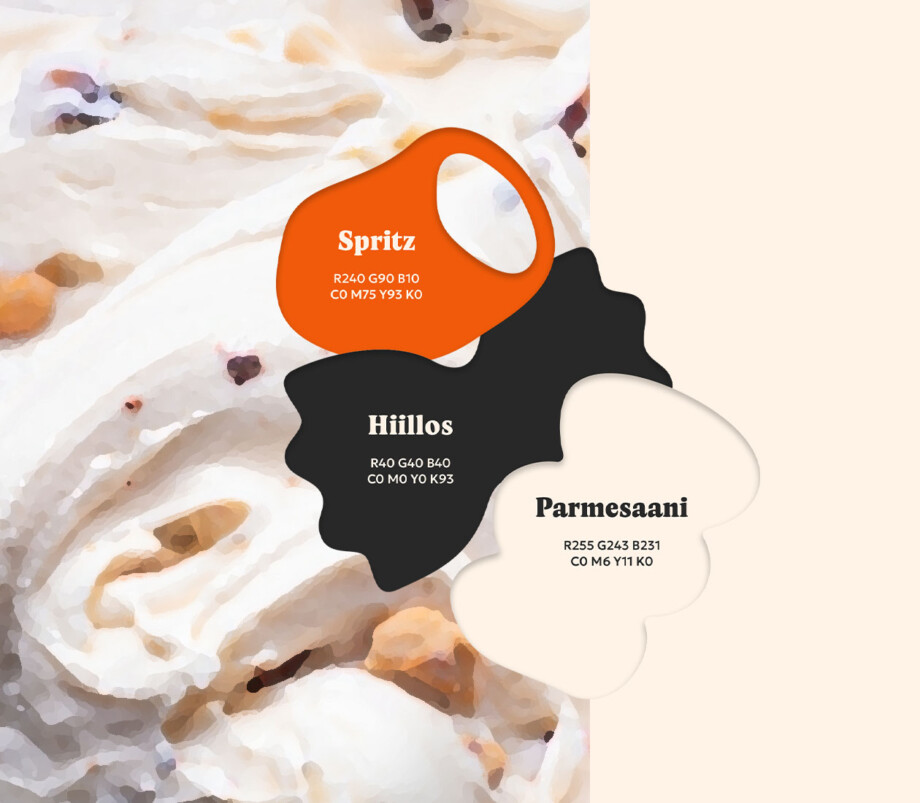
Along with the rasterized images, the snappy utterances also act as their own visual elements. Alongside the strong “Spritz orange” color, Jykevä black and the soft creamy shade of parmesan were added.
“We needed a fresh and distinctive visual look and tone of voice for our new restaurant. Our long-term partner Generaxion quickly tackled the task, and we are really satisfied with the result! As a result of a long cooperation around the conference table, we quickly came to a common vision.”
Ilona Härkönen, Restaurant Manager, Kolme Kiveä Ravintolat
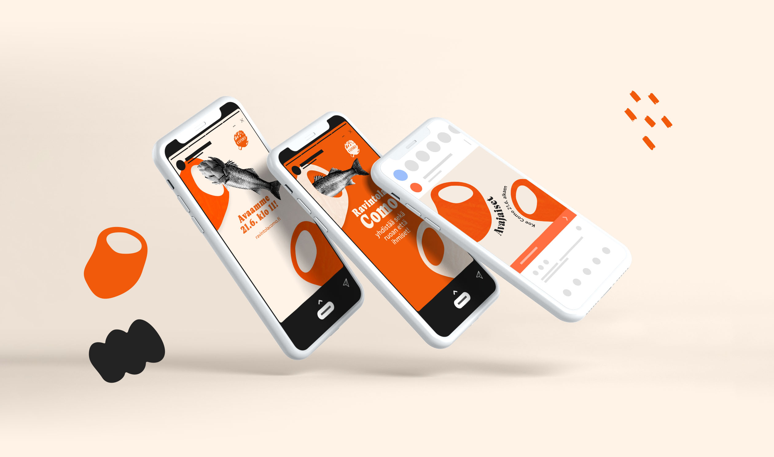
Opening campaign
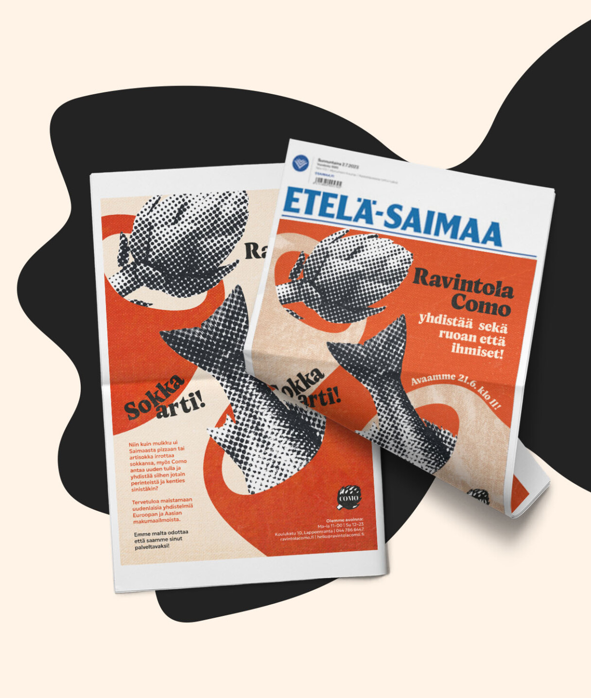
The opening was strongly marketed locally. In addition to digital marketing and mobile outdoor advertising, Como was seen on the front page of the local Etelä Saimaa a few times. The campaign had the desired outcome, and after the opening, the restaurant has been visited by a lot of very satisfied customers.